Embedding the waitlist on your website
When a customer clicks "join the waitlist" on your website, you have two choices: send them to a separate page on a different web address, or have the form appear right there on your own site. The second option is almost always better — the customer never leaves your site, doesn't see a URL change, and the form feels like part of your business rather than a side trip.
This article covers the two embed options, when to choose each, and the styling tweaks that make the form blend in with the rest of your site.
When you'd use this
- You have a website on your own domain (most service businesses do — WordPress, Squarespace, Wix, Webflow, custom HTML, anything).
- You've built a public waitlist per Setting up the public waitlist and have a list URL ready.
- You want the registration to happen inside your site, not on a Suprata-branded page.
- You're comfortable pasting a snippet of HTML or JavaScript into your website's editor. No coding skill required, but you have to know where the page editor is.
If your website is just a Facebook page or Google Business Profile, you don't need this article — link directly to the public list URL.
The two embed options
Suprata gives you two ways to put the form on your site. Both look fine to the customer; the difference is how much control you get over the look.
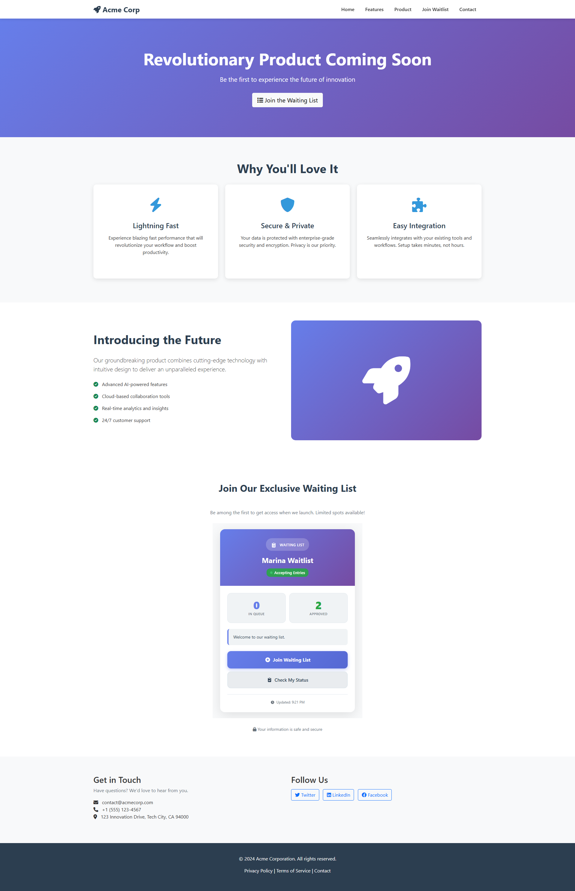
Option 1: The simple embed (iframe)
This is the easy option. Suprata gives you a snippet of code, you paste it into your website's page editor, save, and you're done. The form shows up inside a rectangle on your page.
Good things:
- Easy. Copy, paste, save. Works on every website builder.
- Self-contained. Nothing in the form can interfere with the rest of your site, and nothing in your site can break the form.
- Stable. Once it's working, it tends to keep working through site updates.
Trade-offs:
- Fixed size. You set a width and height. If the form is taller than the box, the customer gets a little scrollbar inside the box — not pretty.
- Limited styling. You can't make the form's fonts match your site's fonts. The form looks like a form sitting on your page rather than part of your page.
- Slightly slower to load. Not a deal-breaker.
Best for: most websites, especially if you'd rather have something working today than something perfect next week.
Option 2: The polished embed (JavaScript)
This option is a little more involved but gives you a much better-looking result. The form actually becomes part of your page rather than living in a box.
Good things:
- Resizes automatically. The form takes exactly the space it needs — no scrollbar.
- Matches your site's fonts and colors with a little extra setup.
- Faster to load than the simple embed.
Trade-offs:
- A bit more fragile. A theme update or website redesign on your end might require revisiting it.
- Slightly more setup. Pasting it in is just as easy, but some website builders only allow this kind of code in certain places.
Best for: websites where you care about a polished, blended-in look, or where the waitlist sign-up is a key part of your site.
Picking the right option for your site
Quick guidance by website builder:
- WordPress with a page builder (Elementor, Divi, Gutenberg). Use the polished embed in a Custom HTML block.
- Squarespace. Polished embed in a Code block.
- Wix. Use the simple embed (iframe) — Wix has restrictions on the polished kind.
- Webflow. Polished embed in an Embed component.
- A plain HTML site you maintain yourself. Either works. Pick the polished one for a better-looking result.
- You don't know how to edit your website. Ask whoever does — your web designer or the person who set up your site. Send them this article and the embed code from Suprata.
Where to find the embed code
In Suprata, open the waitlist list and look for the Share or Embed section. Copy the snippet for whichever option you chose. The code is specific to that list — if you have multiple waitlists, each one has its own embed code. Don't try to reuse one across multiple lists.
Making the form match your site
The form looks plain on purpose, because most websites have their own look and you'll want it to match yours. Here are a few common tweaks. If you're not comfortable with website code, ask your web person to handle these for you.
Match the fonts
The biggest reason an embedded form looks "stuck on" is a font that doesn't match the rest of the page. With the polished embed, you can tell the form to use your site's font with a small bit of styling:
.suprata-waitlist-form,
.suprata-waitlist-form input,
.suprata-waitlist-form button {
    font-family: inherit;
}
inherit means "use whatever font the rest of the page is using."
Match your brand color
The submit button is the most colorful thing on the form. Set it to match your brand:
.suprata-waitlist-form button[type="submit"] {
    background: #2a8b3f;
    border-color: #2a8b3f;
}
(Replace the green with your actual brand color.)
Keep the form a reasonable width
By default the form fills whatever space you give it. On a wide page that can look stretched. Wrap it in a container that limits the width:
<div style="max-width: 500px; margin: 0 auto;">
  <!-- embed snippet here -->
</div>
Test on a phone
Most people sign up from a phone. Pull up your page on a real phone and try filling out the form. Check:
- Can you scroll the form smoothly?
- Are the input boxes big enough to tap?
- Does the on-screen keyboard cover the field you're typing in?
- Does the submit button actually submit?
Fix anything that feels off before you start telling customers about the page.
Sizing tip for the simple embed
If you went with the simple (iframe) embed:
- Set the height generously. 600 pixels tall is a reasonable starting point for most forms. Better to have a little empty space below the form than to have a scrollbar inside the box.
- Set the width to 100% rather than a fixed number — the form will then fill the space you give it whether the customer is on a desktop or a phone.
- Wrap it in a container with a max-width if you want to keep it from getting too wide on big screens.
Sample:
<div style="max-width: 500px; margin: 2em auto;">
  <iframe src="https://your-suprata-domain/waitlist/abc123"
          width="100%" height="600"
          frameborder="0" style="border:0;">
  </iframe>
</div>
Confirming the embed is working
After saving the page on your site:
- Open the page in a private or incognito browser window. This shows you what a real customer would see — not what you see while signed in to your own site.
- Sign up as a test customer using a personal email address you can check.
- Look in Suprata. Your test sign-up should show up in the list within seconds.
- Check the confirmation email. Did it arrive? If you turned on email verification, does the link in it work?
- Check on a phone. Test it on a real phone, not just by shrinking your browser window.
If the form shows up but sign-ups don't reach Suprata, the most likely cause is a security setting on your website that's blocking the form from talking back to Suprata. Some website hosts (Squarespace, and certain WordPress security plugins) have strict rules about what outside services they'll let connect. If you suspect this is the issue, ask whoever maintains your website to allow Suprata through, or contact Suprata support and they'll walk through it with you.
Common mistakes
- Linking out instead of embedding. A link to a separate page works, but you'll lose more sign-ups than if the form were right there on your own page. If you can embed it, embed it.
- Squeezing the simple embed into a tiny box with a scrollbar. That makes the form look like an afterthought. Give it room.
- Hiding the form in a tab or behind a "click to expand" section. People won't go looking for it on their first visit. Put it somewhere they'll see it.
- Embedding two lists on the same page. It's possible with the polished embed, but the page usually ends up cluttered. Put each list on its own page.
- Skipping the phone check. A form can look fine on a desktop and be broken on a phone. Most sign-ups happen on phones — test there.
- Not styling the form to match your site. A plain default form on a nicely designed website looks out of place. Spend 15 minutes (or have your web person spend 15 minutes) making it match.
- Putting the form behind a login. A waitlist is supposed to be public. If a customer has to log in to see the sign-up form, hardly anyone will sign up.
When to revisit it
A few times a year, do a quick check:
- Pull up the page and make sure the form still loads.
- Confirm sign-ups are still coming through to Suprata.
- If you used to get sign-ups regularly and they've dried up, something probably broke.
- After any big change to your website (a redesign, a plugin update), check it again.
Related articles
- Setting up the public waitlist
- Managing waitlist entries
- Setting up email (SMTP)