Branding your customer portal
By default, Suprata looks generic. Your customers see your business name dropped into emails and invoices, but the rest of the look is Suprata's, not yours. Putting your branding on the customer-facing pieces — invoices, emails, the customer portal, payment receipts — is a small amount of work that makes a real difference. A customer who gets a polished, branded invoice has more confidence in your business than one who gets something that clearly came out of a template.
This article covers what to brand, where each setting lives, what propagates where, and the common mistakes that produce inconsistent customer-facing output.
When you'd configure this
- First-week setup for a new tenant. Branding is part of going live; customers should never see the generic defaults.
- After a rebrand — new logo, new colors, new business name.
- After a website redesign — keeping the customer portal aligned with your main web presence.
- When you switch invoice templates — the new template may need its branding configured separately.
- When you add a business unit — each unit may need its own branding; see Business units.
What's actually customer-facing
Inventory the surfaces a customer might see, so you don't miss any:
- Invoice PDF — emailed and printed. Logo, colors, footer text, terms, contact info.
- Receipt / payment confirmation — what they get after paying.
- Estimate / quote PDF — pre-sale.
- Statement — periodic A/R summary.
- Email body — the system emails that wrap PDFs (subject line, intro paragraph, signature). See Customizing the invoice email template.
- SMS messages — if you use them, the "from" name and any signature.
- The public customer portal — where customers log in to see invoices, pay them, view their history.
- Public payment links — when you send a customer a "pay this invoice" link.
- Public booking pages — if you have public-facing service request or reservation forms.
- Customer-facing tracking pages — appointment confirmations, "tech is on the way", etc.
That's a lot of surfaces. Each one has a place where its branding is configured.
The display name — start here
The single most important branding decision is your display name — what customers see in "From:" lines, on invoices, on the portal.
The display name screen lets you set how your business name appears:
For most businesses, this should match your legal name or your DBA exactly. A few rules:
- Match your website and business cards. Customers should see one consistent name across every touchpoint.
- Avoid all-caps or all-lowercase. Use proper title case.
- Don't include legal suffixes in the display name unless you actually go by them ("ACME Plumbing", not "ACME Plumbing, LLC", unless customers know you that way).
- Match what you've registered with your payment processor. Stripe and USIO each show your registered business name on customer card statements; mismatches cause disputes.
The logo
Upload a square or near-square logo, ideally PNG with transparent background, at least 600×600 pixels. The system resizes for different surfaces (small for emails, large for invoices), so a high-res original works in all contexts.
If you don't have a square logo, get one made — most logo design services have a "social media square" version included. The square format works on every surface; a horizontal logo cropped square in the wrong place looks bad.
Where the logo shows up:
- Top of invoices and estimates (PDF).
- Top of emails (depending on template).
- The customer portal header.
- Public payment pages.
- Browser tabs (favicon — usually a separately-uploaded smaller version).
Brand colors
Most platforms let you pick a primary color and sometimes a secondary. The primary color flows through to:
- Invoice header bars / accent lines.
- Button colors on the customer portal.
- Email accent colors.
- "Pay Now" button on payment pages.
Pick a color that's:
- Recognizable as yours — the same color on your website, business cards, vehicles.
- Has good contrast with white (most surfaces are white-background).
- Not pure red or pure orange unless that's your brand — they read as "alarm" in user-interface contexts.
Test on your phone, not just your monitor. Phone screens and printed paper render colors differently from desktops.
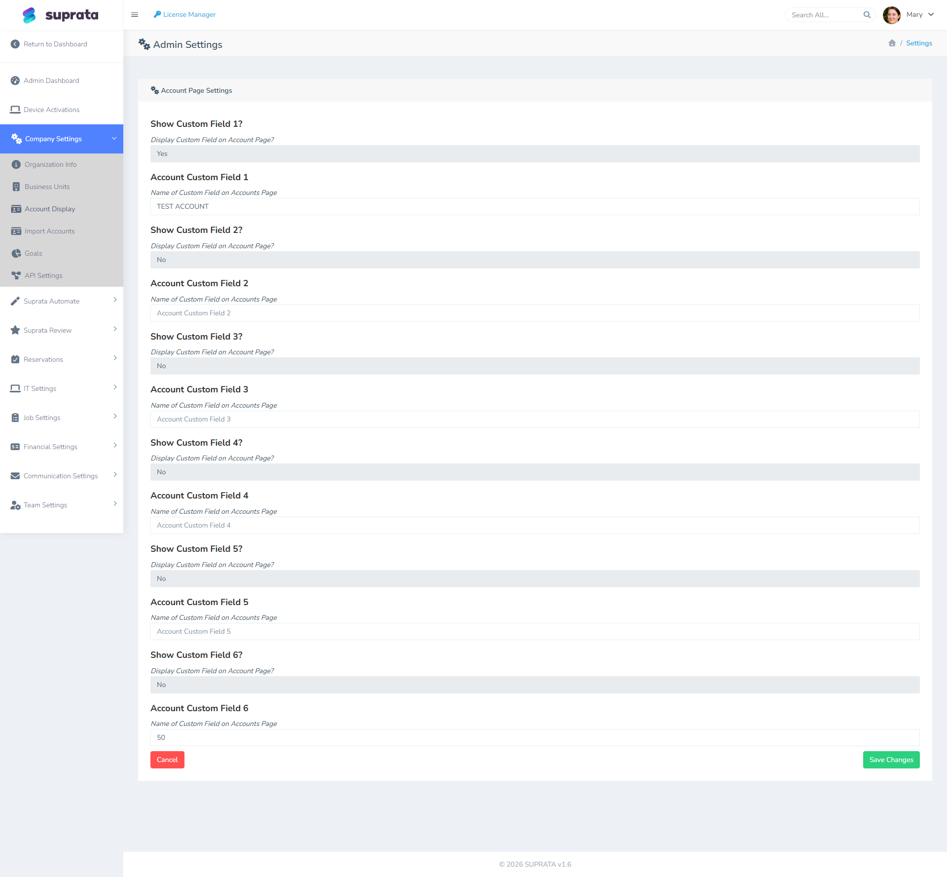
Footer text on invoices and statements
The footer is where you put:
- Your contact info — phone, email, website, physical address.
- Tax / regulatory text — license numbers for regulated trades, state-required disclosures.
- Payment instructions — how to pay (especially if you take checks: "Make checks payable to…").
- A short thank-you line — "Thank you for your business" or similar.
Keep it short. Three to five lines. Customers don't read 12-line footers.
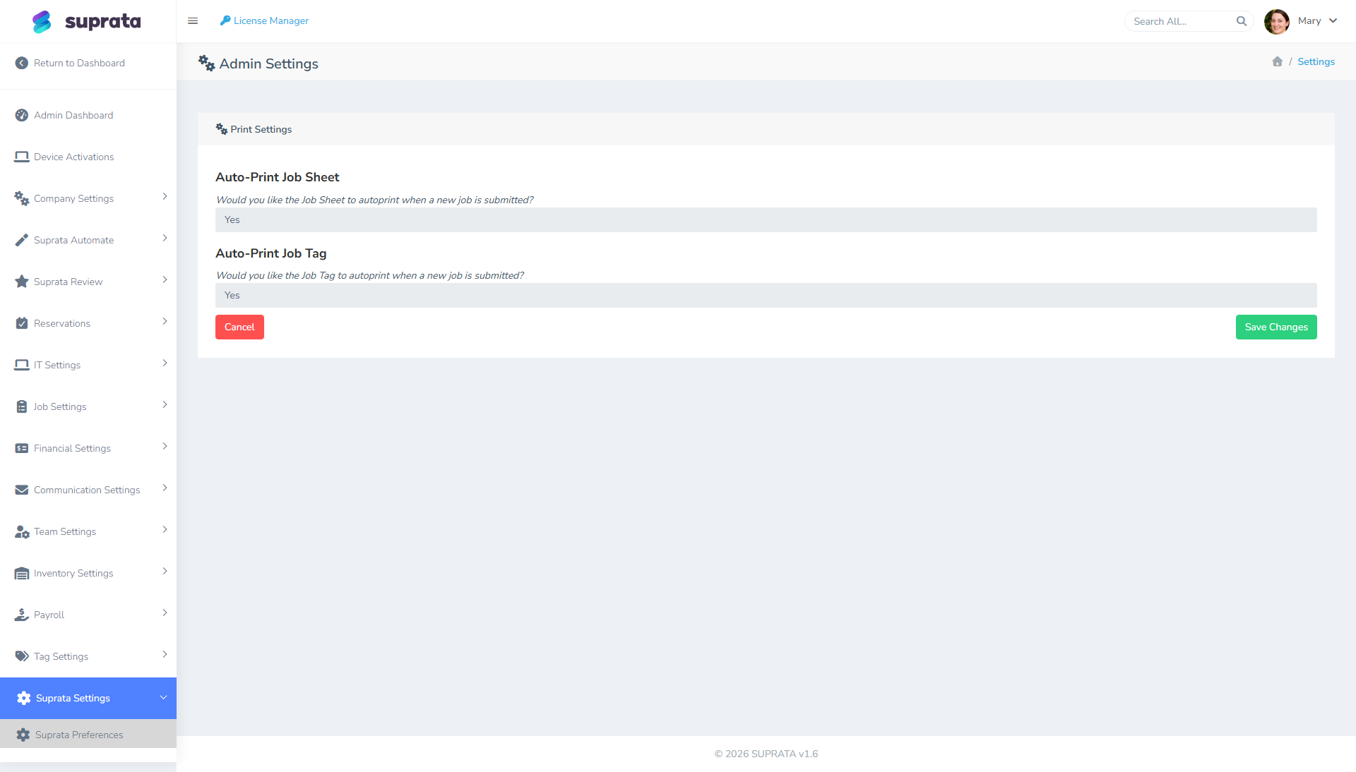
The print-settings screen is where most of this lives:
The customer portal
If your account exposes a customer-facing portal where customers log in to view their invoices and pay them, brand it:
- Logo and color — should match invoice branding.
- Welcome text — a short paragraph on the landing page explaining what the portal is for.
- Support contact — how customers reach you if something doesn't work in the portal.
- Terms / privacy link — link to your terms of service and privacy policy.
The portal is where the most extended customer interaction happens (multiple visits over months or years), so it's worth the effort.
Email templates
Email is its own deep area. The defaults are functional but generic; personalize at minimum:
- The invoice send email.
- The estimate send email.
- The appointment confirmation email.
- The receipt email after payment.
See Customizing the invoice email template for the detailed walkthrough.
What propagates where (the mental model)
Branding settings have an inheritance pattern most users miss:
- Global brand settings (display name, primary logo, primary color) apply by default everywhere.
- Per-business-unit overrides apply when a record (invoice, job) is tagged to a specific business unit. See Business units.
- Per-template overrides can apply per invoice template if you have multiple.
- Per-record overrides are rare but possible — you might brand a single invoice differently for a one-off engagement.
Set the global defaults first; override only where you have a real reason.
Decisions before you start
Do you have professional brand assets ready?
If your "logo" is a low-res screenshot from your old website and your "brand color" is "kind of blueish", spend an afternoon (and probably some money) getting them right before configuring Suprata. The platform will faithfully render whatever you give it; if what you give it is bad, what customers see is bad.
Are you matching an existing brand or starting fresh?
If matching: get the exact hex code of your brand color from your website's stylesheet or your designer's brand guide. Don't eyeball it.
If starting fresh: pick something simple and conservative. You can always rebrand later, but rebranding mid-customer-relationship is jarring.
Are you running multiple brands?
If yes, see Business units before you configure anything. Setting up branding per unit is more flexible than setting up shared branding and trying to override per unit later.
Common mistakes
- Inconsistent branding across surfaces. A polished invoice that arrives in an email with the default boring template undoes the polish. Brand every customer-facing surface, not just invoices.
- Low-res logo. Pixelated on the printed invoice. Always upload at the highest resolution available.
- Brand color that doesn't read on white. Light yellow buttons on a white page are invisible. Test in context.
- Display name doesn't match payment-processor descriptor. Customer sees "ACME PLUMB INC" on their card statement but "ACME Plumbing" on the invoice — they call to dispute. Match them.
- Footer text walls. Five lines is plenty; eleven lines is intrusive. Edit ruthlessly.
- Forgetting the customer portal. It's easy to focus on invoices and forget the portal exists. Customers spend more time there than reading invoices.
- Hard-coded branding inside email body text. "Thanks for choosing ACME Plumbing!" baked into the template — fine until you rebrand to ACME Home Services. Use template variables for the company name where possible.
- Using social-media-only logos. A logo with a transparent square background works on most platforms but breaks on printed invoices where it might render against gray paper. Test print, not just digital.
After setup — the dry run
Before sending anything real to a customer:
- Create a fake customer with your own personal email.
- Send yourself an invoice. Open it. Read it as if you were a customer.
- Send yourself an estimate. Same exercise.
- Make a payment to yourself. Read the receipt.
- Open the customer portal as that fake customer. Click around.
- Print one document. Look at the printed version (printers render colors differently than screens).
Whatever bothers you in this dry run will bother your real customers more. Fix it, then go live.
Related articles
- Setting up your company profile
- Customizing the invoice email template
- Business units
- Choosing an invoice template (forthcoming)
- Your first week with Suprata